Background
In response to the COVID-19 pandemic, the UK government launched the Test and Trace programme to mitigate virus spread by identifying and isolating potential cases and their contacts.
As the Design Lead for the Trace department, I oversaw all design aspects of the user journey, guiding users through providing essential information about their recent activities, workplace, education, vaccination status, and more.
My role involved defining the UX strategy, ensuring accessibility, and building trust through clear, user-friendly design, using the NHS design system. I collaborated closely with third-party suppliers like IBM, Accenture, and Deloitte, navigating rapid iteration and alignment across diverse stakeholders to deliver a platform that millions relied on for critical health information and guidance during a period of heightened stress and uncertainty.
Design leadership and strategy
Stakeholder management
Research plan
User journeys
Accessibility audits
Design decisions and documentation
High-fidelity interactive prototype
The trusted authority for all design-related matters on the programme
Case study
Collecting people's activities during pandemic
Overview
Users require a straightforward method to report their activities and interactions before testing positive for COVID-19, including where they were, when, and with whom.
Agitation:Research showed that the existing information collection process was confusing and time-consuming, leading to user frustration and incomplete data on potential contacts.
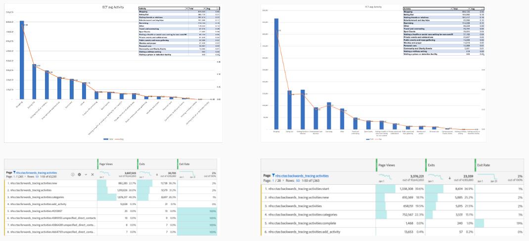
Data showed high drop-off rates during activity reporting, indicating that we were failing to trace contacts effectively - impacting our efforts to prevent the spread of COVID-19 and save lives.
To address the high drop-off rates and cognitive load in the activity reporting process, I led a redesign that balanced user needs with the programme’s data requirements. By simplifying the user journey, I reduced repetitive data entry, structured the questionnaire around timelines to aid memory recall, and introduced clear categories for activities and contacts. Collaborating with cross-functional teams, I ensured the new design was user-friendly, inclusive, and compliant with accessibility standards. Prototypes were developed and tested with users, confirming that the improved flow significantly reduced frustration, increased completion rates, and provided accurate, actionable data for contact tracing.


Empathize & Define
-
1
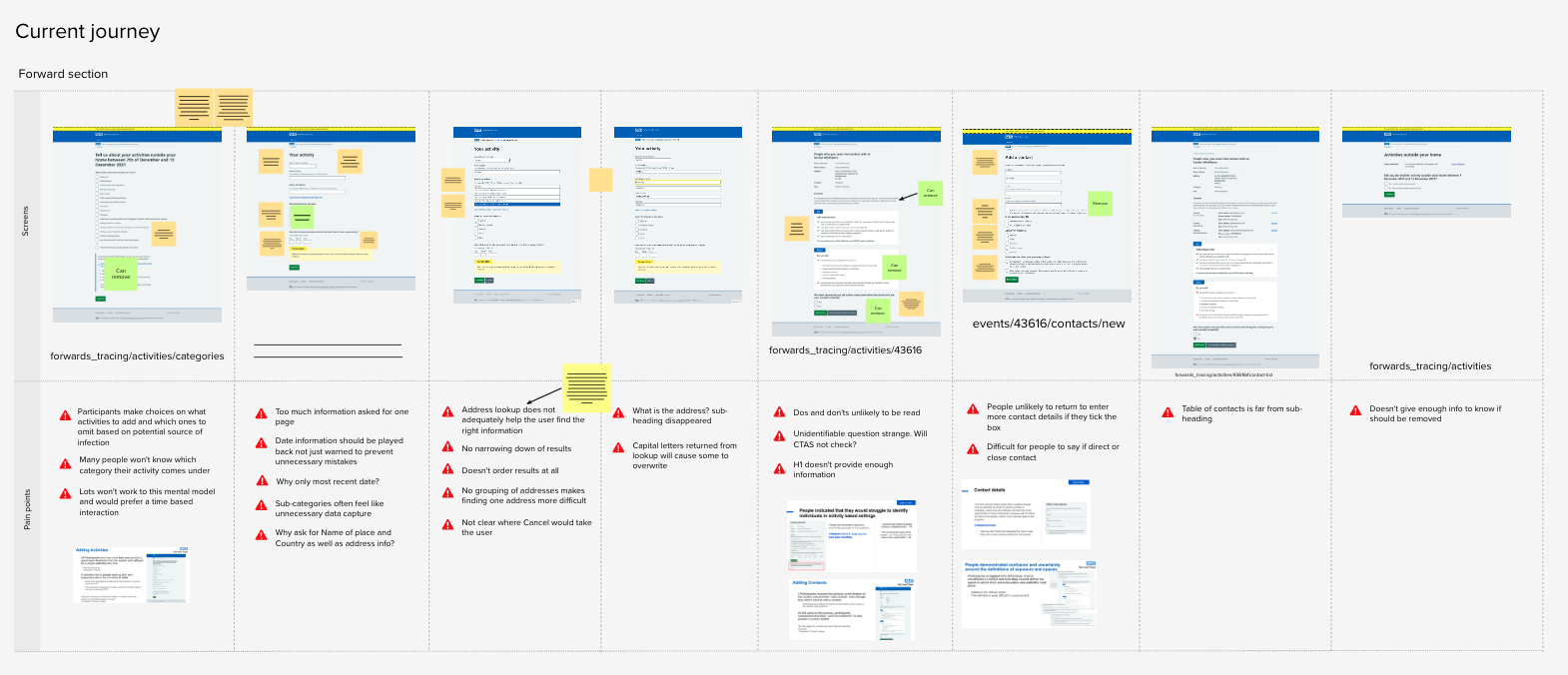
Mapped the current journey on a digital board to visualise the existing user experience.
-
2
Reviewed user feedback from previous research and testing to understand existing challenges and frustrations.
-
3
Mapped specific pain points from user feedback against each screen in the journey to pinpoint exact issues.
-
4
Collaborated with the data team to gather relevant data, including drop-off rates, to understand how many activities users were currently completing and to identify any points in the journey where users were likely to abandon the process.
-
5
Conducted discussions with Call Agents alongside the User Research (UR) team to gain insights on user issues and frustrations from those assisting users directly.
-
6
Aligned with the Product team on a problem statement, hypothesis, user scenarios, and formulated a “How might we…” statement.
- reduce the number of data entries for each activity, and thus minimise the cognitive load
- simplify the data entry process by removing some repetitive data
- allow users to select multiple activities to increase the reported data
- make the service clearer and easier to understand
- simplify the process of entering the contact details
-
7
Identified and documented user needs to ensure a user-centred approach.
-
8
Organised a workshop with the Clinical Lead and data team to clarify business needs and data requirements, questioning each data point for its purpose and rationale. This provided a clear understanding of essential information for the redesign.
-
9
Led a kick-off meeting with key stakeholders to present the scope and potential value of the redesign effort.
Challenge:
The clinical need for exhaustive data was creating a high cognitive load for users - often exhausted post-COVID - leading to abandonment.
Problem statement:
I am someone who has tested positive for Covid-19
I am trying to inform the contact tracing service of my activities prior to my positive test or symptoms
But it is difficult and confusing, and takes a long time
Because of the way that the service requires me to input the information
Which makes me feel confused and annoyed, and I am less likely to enter all my activities
So, how might we:
Balancing data requirements with user experience:
A major learning came from managing the tension between the clinical need for comprehensive data and the user's ability to provide it. Simplifying the process without compromising on data quality required careful negotiation with cross-functional teams and a constant focus on the user experience.


Savina really excels at communicating with stakeholders and she’s been an invaluable voice in helping us persuade them into a more UCD way of thinking. She is always excellent at leading the client in meetings and I’ve witnessed stakeholder’s attitude change from resistant to excited quite quickly during her presentations, and it was very impressive.
Ideate & Wireframes
Before jumping into solutions, I recognised the importance of understanding how the human brain retrieves memories. To build a strong foundation for our design, I took the initiative to research how other governments approached similar challenges and reviewed psychological papers on memory. I also delved into reports on eliciting accurate information from witnesses during interrogations— because what better place to find motivation to remember details than in prison!
This research uncovered several key insights:
“memories for experiences that occur around the same time are linked together by a shared time frame or temporal context”
“timelines help people not only remember what they've seen, but also remember more information about the people involved and when specific events took place”
These findings shaped my approach to addressing the activity collection process. I structured the initial questionnaire around a timeframe, prioritising the collection of dates first. I created an information architecture and visualised it in a diagram flow, which I presented to the team.
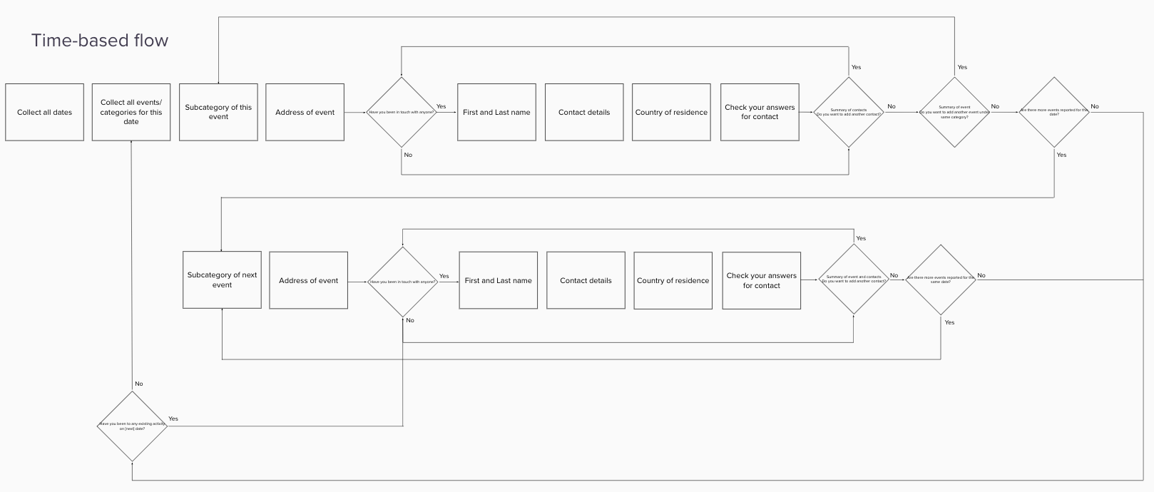
In addition to the timeline-based approach, I explored an alternative solution focused on the types of activities users might report. I hypothesised that providing users with a list of possible activity types could help prompt their memories about what they had done.
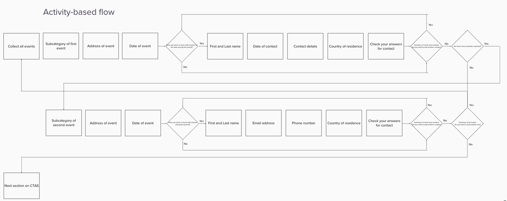
Throughout this process, I actively engaged with cross-functional teams, including engineering and data specialists, to ensure that my designs were technically feasible. I sought their feedback on both diagram flows, which received positive responses and approval from stakeholders, validating my approach.
By balancing my contributions with collaborative discussions, I laid the groundwork for the next steps in the design process, ensuring that our solutions were user-centred and practical.
Collaboration across teams:
Effective collaboration with cross-functional teams, including data, engineering, content design, and user research, was essential. It ensured that all aspects of the design process were technically feasible, aligned with guidelines, and created a coherent user experience. Regular workshops, discussions, and feedback loops were crucial for refining our approach and driving consensus.
Design
I created the high-fidelity designs, carefully addressing all identified pain points, accessibility considerations, and users' feedback.
To ensure a smooth implementation, I organised a data-mapping workshop with the engineering and data teams, aiming to prevent any blockers related to data structure changes later on.
Throughout this stage, I collaborated closely with the Content Designer to navigate various challenges and refine content ideas, ensuring our messaging was clear, consistent, and user-centered.

Challenges
One of our biggest challenges was organising the extensive list of possible activities a person might engage in into simple, clear categories and subcategories for users to select from.
Our initial list, provided by the Clinical Data Team and Epidemiologists, was thorough but overwhelming. While they required detailed data for effective contact tracing, previous usability testing had shown that people recovering from COVID-19 were often too exhausted to handle the cognitive load of a lengthy and complex questionnaire. This put us at a crossroads: we could either simplify the questionnaire to improve response rates and data quality or retain all details and risk reduced user engagement.
I had to lead challenging discussions and manage diverse perspectives to achieve consensus on a single approach. It was essential to balance providing all necessary information to the client while minimising the burden on users to preserve a positive experience.
In the end, after navigating these challenges, all designs, categories, and content were approved, and we were ready to move into testing.
Simplicity is key, but not at the cost of clarity:
Simplifying the user interface and questionnaire was necessary to reduce cognitive load. However, we also learned that simplicity shouldn't come at the expense of clarity or the richness of information required for effective contact tracing. Striking the right balance between these competing needs was a key takeaway from the project.
Prototype
I created two fully interactive prototypes—one for each user flow—that capture user input, branch journeys, and pass data, using HTML, CSS, JavaScript, and jQuery.
To ensure consistency across NHS services, I aligned the prototypes with the NHS design system.
I prioritised accessibility, following WCAG guidelines closely in both the code and the visuals to make the prototypes inclusive and user-friendly.
A short demo of one of the prototypes showcasing the process of adding an activity
Test
I worked closely with the User Research (UR) team to identify scenarios and methods for testing.
First, we conducted a card sorting exercise to validate the new categories and subcategories, ensuring that their grouping made sense to users.
Next, we tested both user flows with 12 participants, representing a diverse range of sex, age, ethnicity, and location.
Main aims of testing:
- To identify potential pain points or blockers in both flows that could hinder users when adding multiple activities and close contacts, as well as providing accurate information.
- To assess the difference in user experience between structuring questions around dates versus activities first, particularly in terms of aiding recall of events and the ease of adding activities and close contacts.
Main findings from testing:
- Users found both updated flows to be simple, straightforward, and easy to follow. However, structuring the questions around activities helped trigger users to recall activities they hadn’t previously remembered.
- Overall, participants considered the listed categories and subcategories to be comprehensive and logical.
- All users successfully added multiple activities and close contacts in both flows.
Iterate
I collaborated closely with User Research and Content Design to incorporate all user feedback and apply the necessary changes. Although time constraints prevented us from conducting another round of testing, we planned to validate this journey in the next phase of work.
I presented the final designs to stakeholders, who were highly satisfied with our process and final outcome, leading to a swift sign-off.
Importance of clear communication and stakeholder alignment:
Keeping stakeholders aligned and regularly updated throughout the process was crucial for ensuring that the design met both user needs and business goals. The successful sign-off from stakeholders demonstrated the value of maintaining open lines of communication and securing their buy-in at key stages.
Next steps
This was only the initial step in enhancing the process for collecting activity information. We developed a backlog of improvements based on user feedback and design best practices, which included:
- Organising the questionnaire around a task list and adding a progress bar to set clear expectations for completion time
- Adding an interactive calendar to help trigger users’ memories
- Applying insights from this work to guide the redesign of similar sections in the journey
- Developing a more intuitive user interface overall
Outcomes
After taking over the Contact Tracing service, the redesign not only improved the user experience but also contributed to broader successes. Within months of implementing the new design:
-
The press coverage shifted, with more positive stories than negative, restoring public trust in the service
-
There was a 30-40% uplift in successful contact tracing, improving the effectiveness of the program
-
Customer satisfaction data saw a 10% increase, showing the positive impact on users
-
Business costs were reduced due to better management of communication channels, leading to a more efficient service overall
Tools

