Case study
Leading design iterations and documentation during Alpha
Background
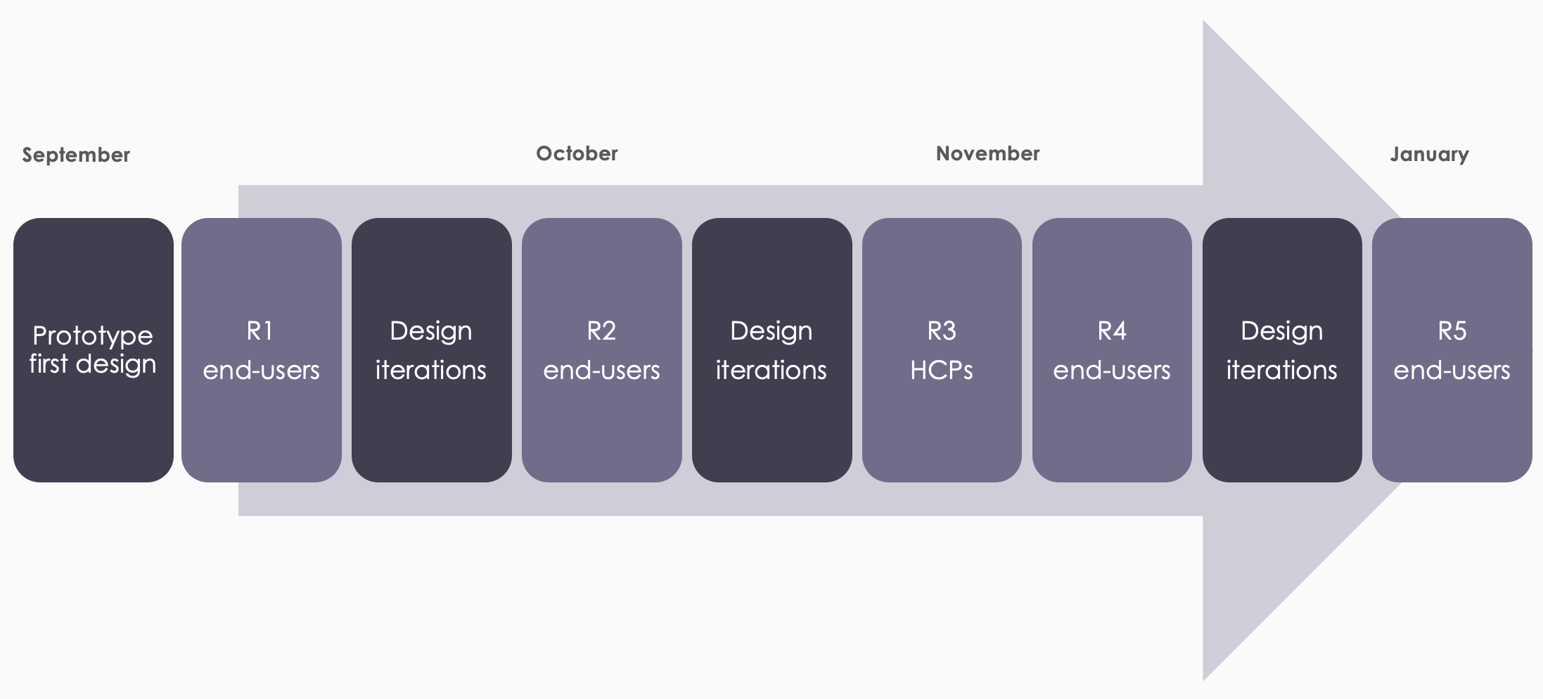
The aim of Alpha was to improve our understanding of the users and their needs. We tested different ideas and prototypes through 5 rounds of usability testing to learn and develop a solution that helps users achieve their goal.
Research methods
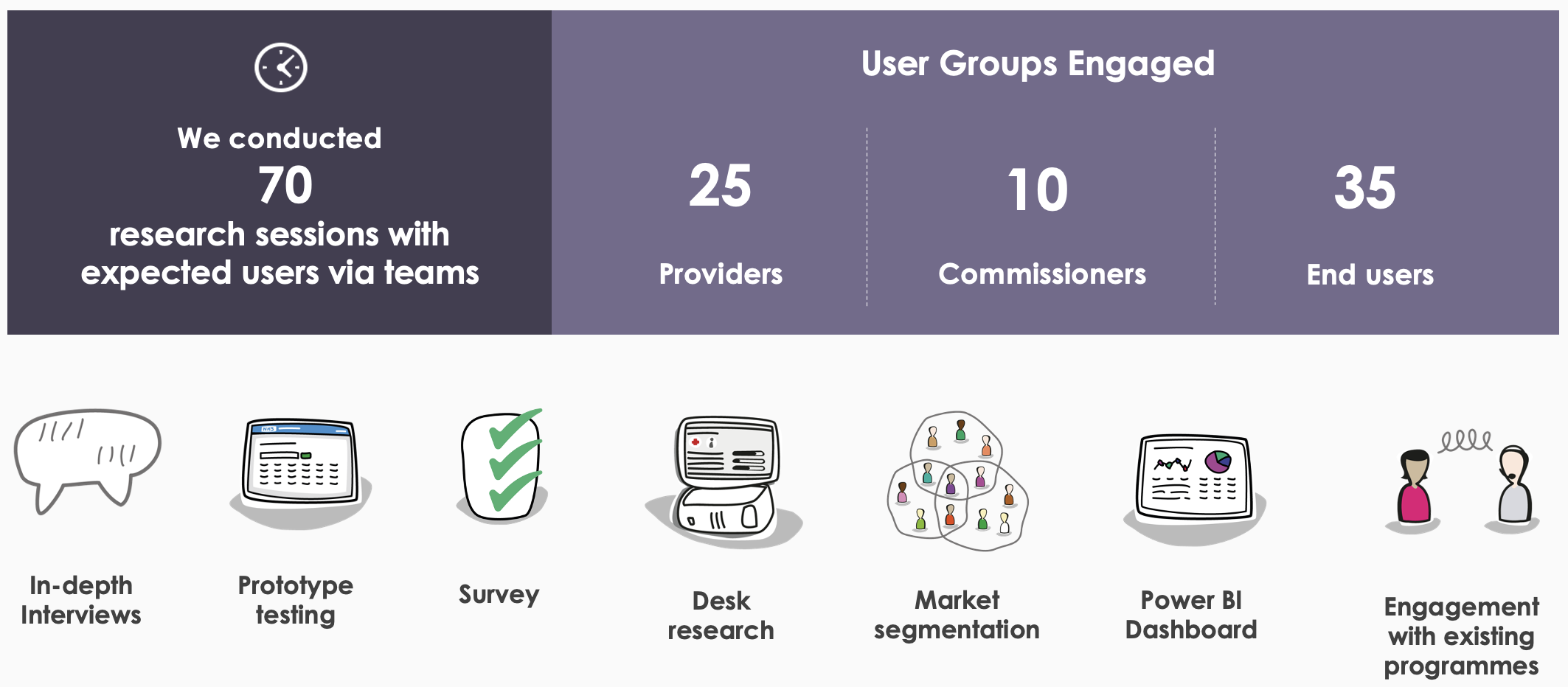
We conducted 70 research sessions with user groups identified during Discovery. I collaborated with the UR team on the research plan, which included:
- in-depth interviews - to give us a thorough understanding of current experiences & processes, attitudes, behaviours and needs for a future service
- prototype testing - to help us test our riskiest assumptions with our primary user groups
- desk research (reviewing prior research and pilots & engagement with existing teams) - to ensure that we weren’t duplicating work and had clearly identified gaps prior to conducting our own research
- reviewing market segmentation & existing knowledge on the user base (Power BI) - to help us frame and target our research
Our users

Our Primary users are people form the general public who:
- are aged between 40 and 74
- are registered at a GP Practice in England
- have not had an NHS Health Check in previous 5 years
- do not have a pre-existing condition from defined list

Our Secondary users are Providers and Commissioners of the NHS Health Check:
- GP Administrative Staff
- GP Healthcare Assistants
- GP Practice Nurses
- Pharmacy Providers
We used the market segmentation, along with what we have learned from previous research in the Discovery to map potential users across different scales.
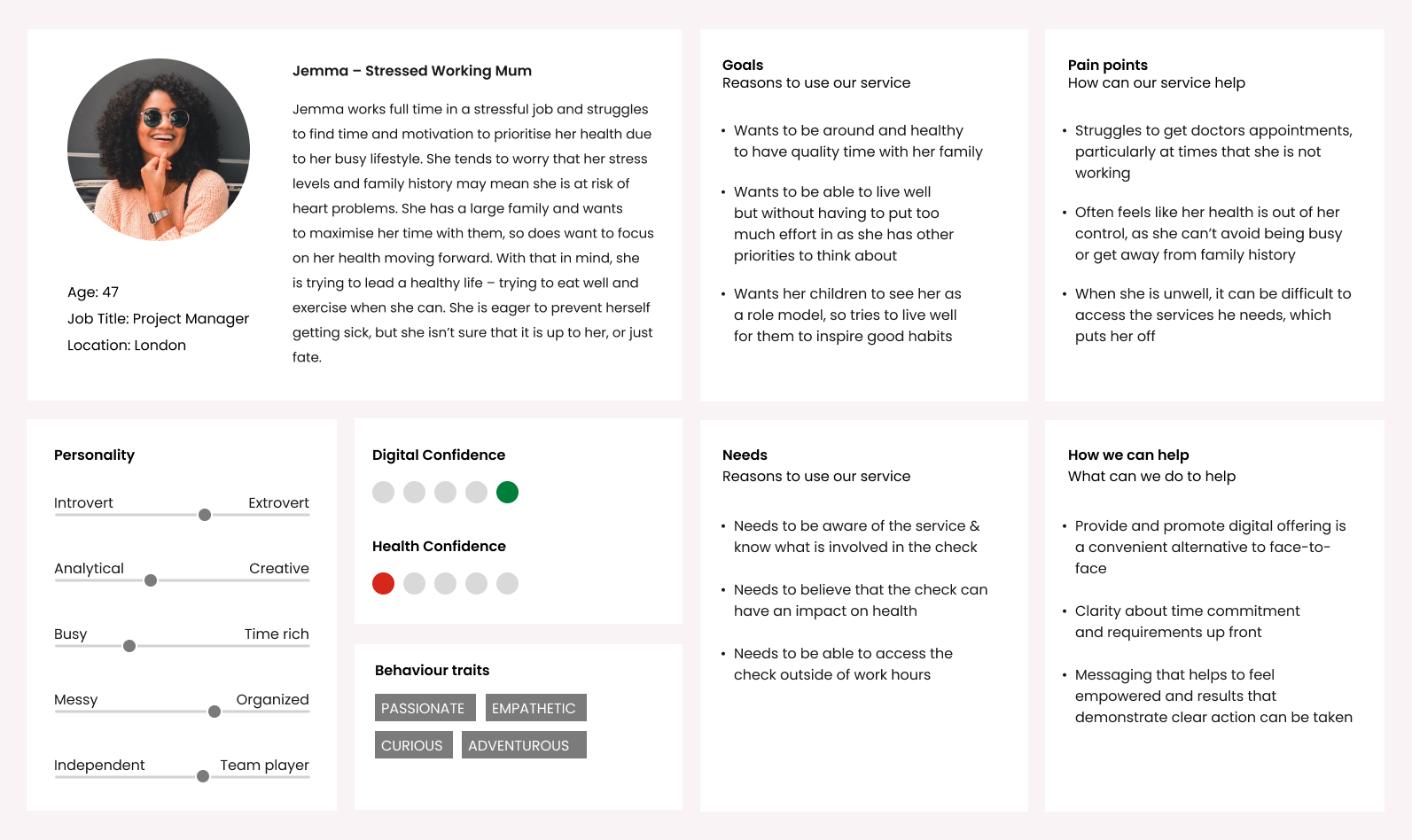
We developed profiles of potential users across these scales, and made some assumptions about what this may mean in the context of a digital offering. These are just examples and potential ways that people will react and experience the Health Check – based on what we have seen in research.

While the digital service will be designed with all eligible adults in mind, there are times when the face-to-face service will be more appropriate for the patient. As mentioned in the vision – we are not trying to replace face-to-face – we are aiming to increase the flexibility and reach of the NHS Health Check. Users will be split across the face-to-face and digital service, based on a number of factors such as patient preference, provider discretion, health confidence, risk factors and digital confidence.
We developed 12 personas to indicate where our research has highlighted that the digital service will likely be the desired route, and where the face-to-face service will be a more appropriate option.
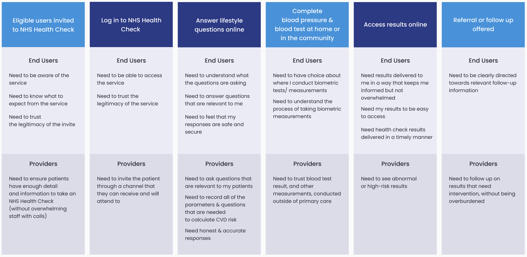
Based on our findings from previous research and similar services, we identified the users' needs and mapped them accross each step of the journey.
Ideation & Prototype
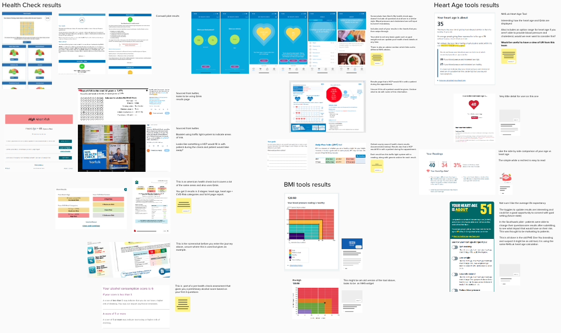
I worked closely with the Product team to build upon their efforts from the Discovery phase. This involved conducting market research to identify other services offering similar health checks and results. We meticulously mapped out relevant screens and information, with a particular focus on maintaining consistency with NHS services across the account.
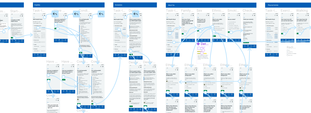
I used Figma to develop an interactive prototype of the service, ensuring alignment with the NHS design patterns, components and content style guide for consistency with other NHS services. Given that the service was going to be integrated into the NHS App, I incorporated their header and footer components into my designs.
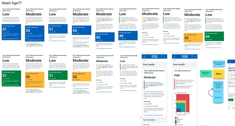
I facilitated ideation sessions and workshops with the designers whom I mentored for this project. One screen, in particular, demanded significant attention – the Results screen. Given its pivotal role in showcasing the service's primary objective, we dedicated considerable time to ensure the health results were presented in a clear and user-friendly manner.
Test & Analysis
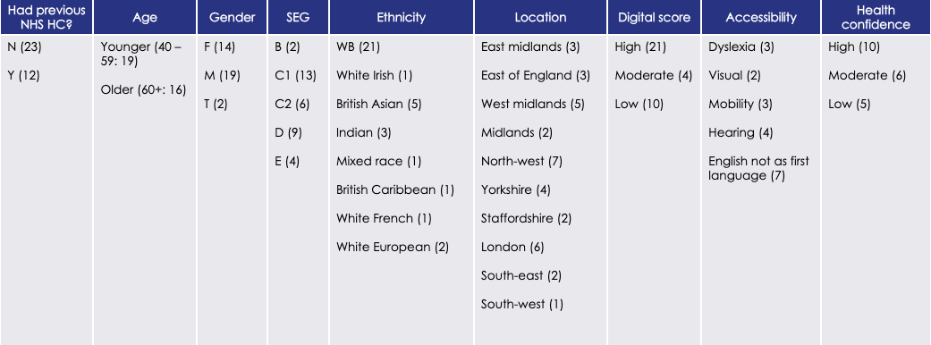
We validated our riskiest assumptions and ideas through 5 rounds of testing with over 60 participants. We ensured diversity among participants in terms of age, ethnicity, location, accessibility needs, health confidence, and more.
I collaborated closely with the UR team to create discussion guides, define participant recruitment criteria, and document session notes. We reviewed analysis together after each round to ensure comprehensive understanding of pain points and user sentiments.
Iteration and key changes
I iterated on the prototype after each testing round, incorporating user feedback and insights gathered from the sessions. Key updates resulting from user feedback included the addition of a Task list and modifications to the Results page.
Task list
In the initial testing rounds, users provided feedback indicating confusion about the duration and expectations of the journey. Despite setting expectations on the Start screen, many users were scanning the text and overlooking the different stages of the journey.
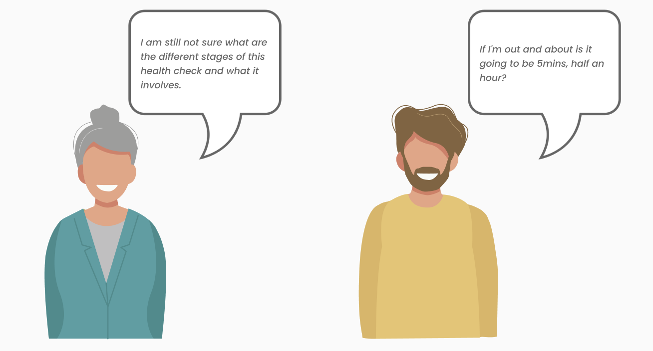
It's challenging to predict the duration of the journey, as it involves measuring weight, blood pressure, and conducting a blood test, which can vary significantly depending on the user. However, we can introduce structure to the journey to clarify what's involved in a more tangible way, making it easier for users to understand than relying solely on text.
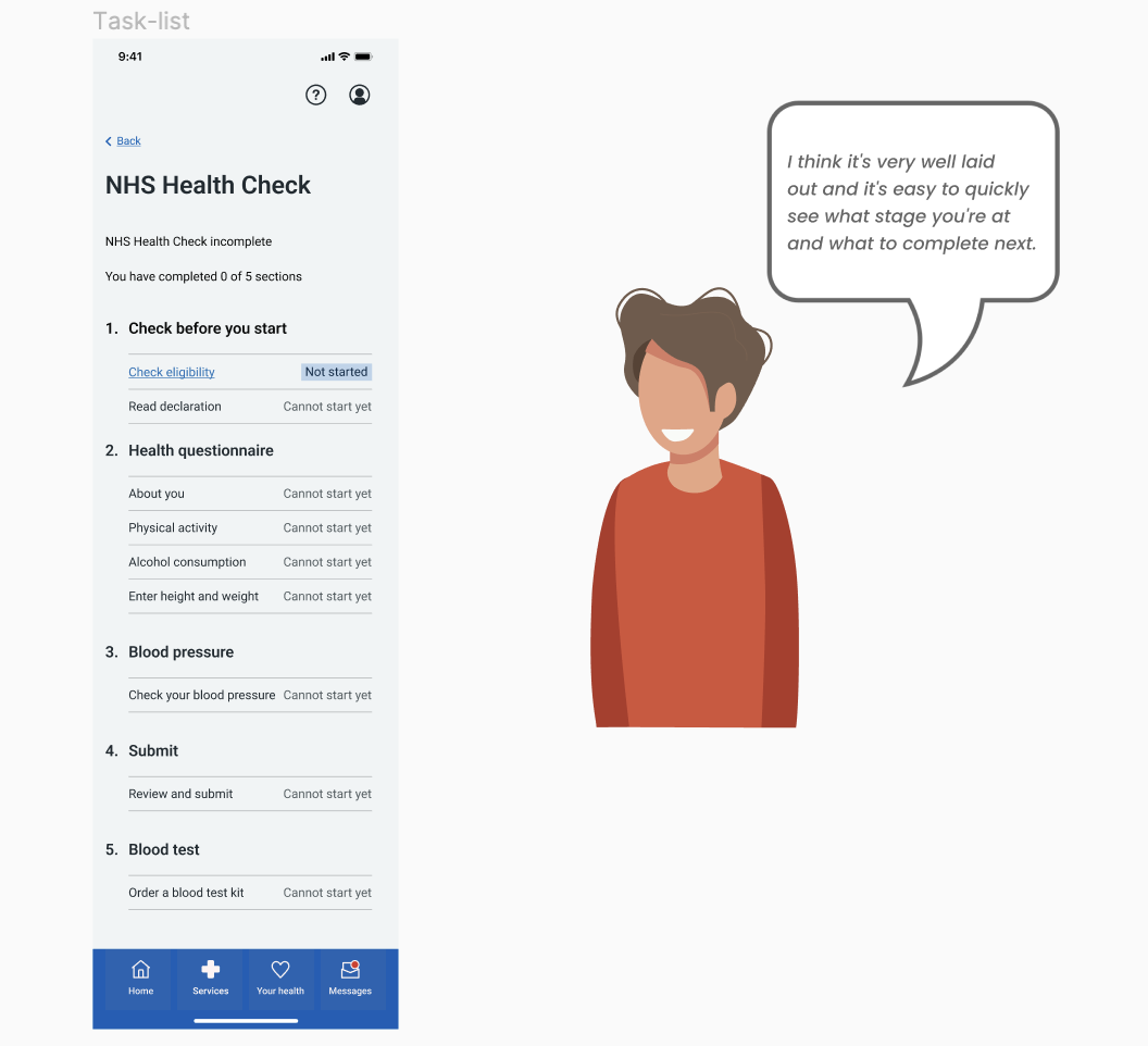
Therefore, we implemented a Task list to illustrate the step-by-step progression of the health check, outlining the various stages of the service and indicating whether they have been completed. Feedback from subsequent rounds of testing revealed that users, upon reviewing the Task list, acquired a clearer understanding of the journey and felt more confident of what it includes and how long it might take them to complete it.
Results page
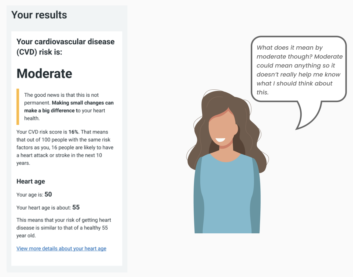
The Results page underwent multiple iterations to ensure we used the best way to present the results for the user to understand and act on if necessary. Despite my suggestion to lead with the Heart Age for easier comprehension, a decision from Policy emphasised focusing on the Cardiovascular Disease (CVD) risk score, aligning with the service's primary purpose.
Initially, we displayed the CVD risk as a percentage per stakeholder request. However, during usability testing, participants found the percentage confusing and were unsure about its meaning. For instance, a 16% CVD risk indicates a moderate risk level, translating to 14 to 16 out of 100 individuals with similar risk factors likely experiencing a heart attack or stroke within the next 10 years. Despite clarifying this information below the percentage, users predominantly focused on the number itself, often misinterpreting the 16% as indicating low risk when, in fact, the risk level was moderate.
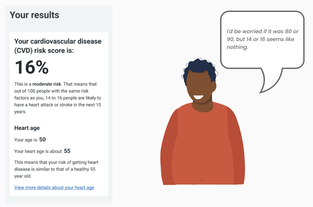
In the subsequent testing round, we replaced the percentage with descriptive terms, aiming to enhance user comprehension and highlight that 16% represented a moderate risk rather than low.
Nevertheless, participants remained uncertain about the meaning of CVD and whether they needed to take action based on these results. Instead, they continued to focus on the heart age below, which was more intuitive and understandable to them.
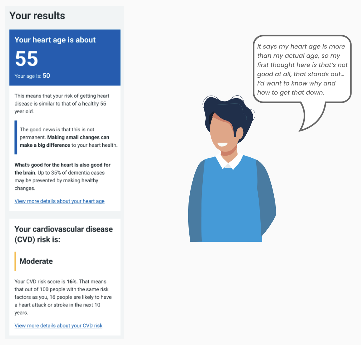
In the next round of testing, we started with the Heart age first and this led to the desired outcome. Participants could immediately determine whether there was cause for concern regarding their results at first glance. Comparing their heart age to their actual age made it evident whether improvements needed to be made or not. This approach increased confidence and provided reassurance to participants, including those with low health confidence.
Documenting design decisions
Conducting five consecutive rounds of usability testing over five months and iterating on prototypes in between can be quite challenging, especially when ensuring thorough documentation to capture every pain point, comment, and decision effectively.
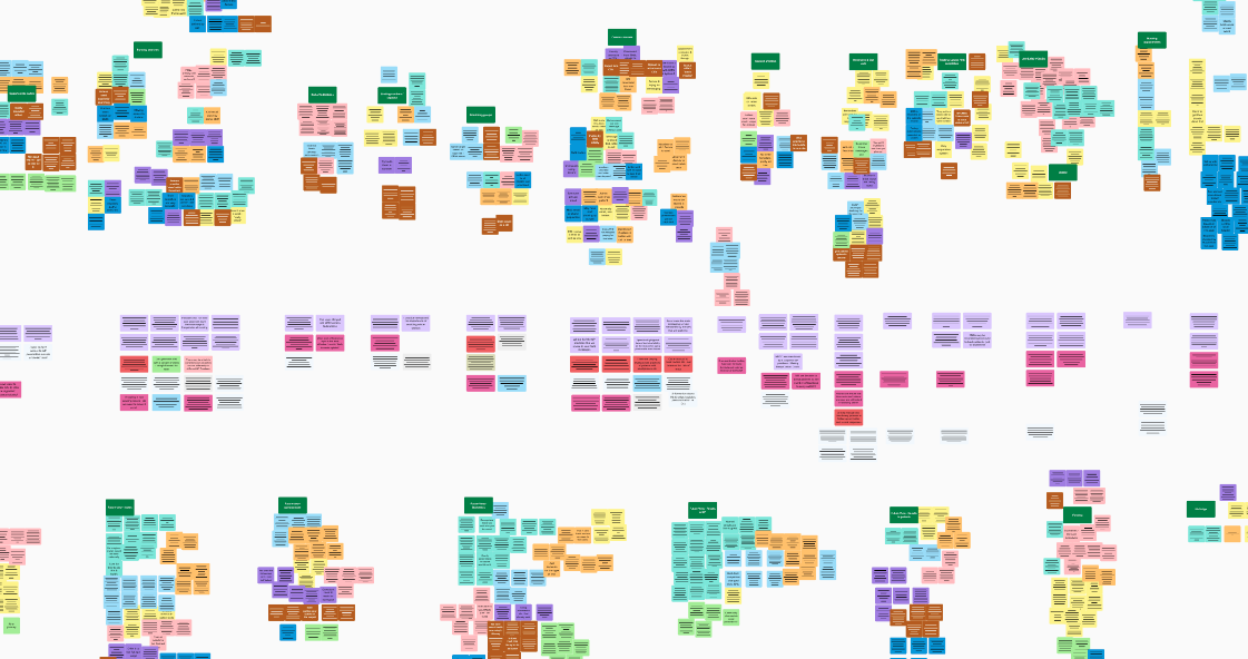
To address this, I implemented a visual system to organise user feedback, stakeholder and team comments, and every design change and decision made throughout the process. This approach ensured transparency in our work, providing everyone with clear insight into what was tested, identified pain points, recommendations, and design changes for each testing round. This enabled us to effectively track the prototype's evolution over the five months of testing and proved invaluable during presentations to clients and the Alpha assessment commitee.
This is a condensed overview to highlight my documentation process. First, I'll summarise all decisions made prior to this testing round, including the riskiest assumptions identified before and after testing, and incorporate the UR presentation for this round. Next, I'll map the user journey and document pain points identified during testing for each screen. The UR team will then add information on what tested well and provide any recommendations. Following that, I'll present each screen that's being changed, showcasing before-and-after views along with the reasoning behind the changes. Finally, I'll compile all unresolved pain points from this iteration round and categorise them as "Next," "Later," or "Not in focus." This process involves close collaboration between User Researchs, Content Designers, and UX Professionals to ensure that we effectively capture and address every pain point and piece of feedback.

Learnings
The Alpha phase focuses on testing assumptions and experimenting with various ideas, which fosters a mindset of thinking big, creativity, and strategic problem-solving. This phase challenges you to deal with uncertainty and design without having all the answers. It requires the ability to adapt and adjust design strategies based on insights and feedback, demonstrating flexibility in design thinking. The Alpha phase emphasises the importance of conducting thorough research, maintaining comprehensive documentation, and practicing organization and efficiency in design processes.
Over the course of six months, I gained valuable experience in Design Leadership and mentoring, focusing on selecting the right strategy, tools, and individuals for specific tasks. This involved delegating responsibilities, organising workloads, and motivating team members effectively amidst considerable uncertainty and ambiguity.
Next steps
Following a successful alpha assessment, we secured the Private Beta phase, signalling our readiness to deliver the defined MVP. Thanks to our meticulous documentation, we had a backlog of recommendations and improvements ready to enhance the end-to-end service, ensuring continuity from the Alpha phase.
We took the opportunity to regroup, establish ways of working, and engage with various stakeholders, including those providing clinical input. Key areas of focus would include refining aspects related to biometrics and the blood test logistics, as well as gathering clinical insights on the journey developed thus far. We will keep test and iterate the journey until it is ready to test in a Beta release.